Saturday 7 January 2017

Response To Question 1


Upon reflection I feel the use of masculine colors really helped to portray my model as a masculine person however I also feel it restricted my TA to only males s the color scheme throughout is very masculine.

My magazine genre is acoustic and from my own research I found that the top button being undone was a convention of acoustic guitarists, by instructing my model to do so i found it worked well in portraying him as a stereotypical acoustic player.

Monday 2 January 2017

Response To Question 6

Throughout the production of my magazine I used a range of technologies:


  • Powtoon 
  • Blogger/blog-spot 
  • Prezi 
  • Thinglink 
  • Gmail 
  • Adobe elements 11 
  • Flickr 
  • Microsoft power point 
  • Microsoft word 
  • Camera
  • Tripod
  • Memory card
  • Memory card reader 
  • Slide share 
  • Slidley 

The very first thing we did when we began our AS media course was set up at blogger account, we began simply with learning how to create and publish posts and through initiative and teacher guidance we learnt how to insert pictures and text and take screen grabs to show what we were seeing on the screen at that moment in time. Blogger has been an excellent application to use its fun quick and easy to learn and did not hinder my research, planning or construction at all!


I created a flickr account to post my pictures on and get feedback from local people to see which photos people liked and which people were unsure about. I thought this was a really fun way to engage with my TA and understand their opinions.


I used Powtoon, Emaze, Prezi, Thinglink, Slideshare and Slidley to present evidence of my external research in fun and different ways. My favourite application to use was Thinglink, I found it extremely easy to use whereas some of my peers found it difficult, I liked the interactive aspect of it as it also requires the viewer to have a keen eye at specific areas.


My gmail account played a huge part in the production of my magazines as without it I would of been unable to gain access to all the different websites needed to log research and planning.


Adobe Elements 11 Also played a huge part in my magazine production as this was the software that used to create my product. I really enjoyed learning all the different tools that adobe had to offer;

Toolbox overview

A lot of the tools I didn't fully understand, but we were instructed to make constant saves throughout so if we made a change that we didn't like we could revert it, it was also a safety measure in case the application shut down which did happen to me! luckily I had a stream of save files to revert to. The constant stream of saves allowed me to spend some time playing around with the tools to see the different effects which I enjoyed.

The camera and tripod was extremely helpful when it came to acquiring pictures of my star model and pictures for things my magazine would feature, without the tripod my pictures would have been of balance and most likely blury. after taking photos I took the memory card from the camera placed it within a memory card reader and put it into the mac, before we took the memory card reader out we had to eject it on the mac itself or we risked corrupting the files on it, luckily non of us did! 

Being an avid user of computers helped me a lot! it also helped my peers as i was often confided in for help with some applications. This AS media course has taught me a rank of skills in all digital fields which I am thankful for

Sunday 1 January 2017

Response To Question 7

Preliminary Task:


Through this course I learnt that following traditional conventions was a big part of having a successful magazine, to attempt in doing this on my preliminary task I gave my magazine a large masthead to catch the eye of the reader, a sell line to help persuade the reader into buying my magazine and a slight range of what is going to be in my magazine.


Before taking the image that is displayed on the front cover I needed to find a clear lit area within my school that had a blank wall so there was nothing on their to distract the readers attention. By having this model looking directly into the camera and smiling at the audience I feel as if I have created an excellent focal point for the audience to engage with.


The fonts used on my front cover is the default font given, it is the same font throughout, Now I am nearing the completion of my course I fully understand why the default and repeated font is a huge problem for my magazine, It makes it look plain and boring.


There was no planned color scheme for my magazine the fact he is wearing a black top and my font is black is sheer coincidence however I feel that highlights my ignorance to these types of factors at the beginning of the course.

My lesser knowledge meant that when it came to having things displayed on the page to attract attention i couldn't as I wasn't as well versed in Adobe Elements 11 as i am now.


In comparison to my latest magazine I feel it highlights clearly the areas I have improved.
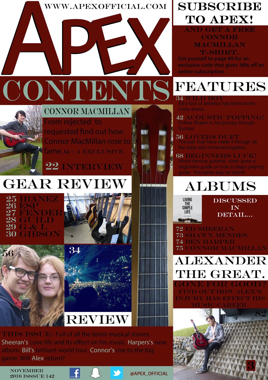


    Final Product:


After copious amounts of research and planning I decided when I came to making my magazine I would try to include as many conventions as I could, I included a large masthead with a 3D effect to attract attention to it, I also did this to make it easily distinguishable for my TA. I have a sell line to help in the persuasion of my magazine to my TA.


I have used a range of different fonts and font sizes, I feel this places emphasis on the more  important stories by giving them a larger font size.                                                                                                                                                                                            I used alternate colored banners at the top and bottom of the page which included key words as to what was inside the magazine, the bottom banner also has social media links which appeal to people of the digital age.                                                                                                       

The color scheme used were extracted from the color of my models top and guitar to help create synergy throughout the magazine, 


The bar code, issue and price is clearly displayed in the bottom left, I attempted to place it in an area where it would not take attention away from other aspects without making it too hard to find for the reader.


 I have used pugs and puff on my page to attract the attention of the reader and to entice them into reading on.

Graphological Aspects:

Front Cover:- I asked my model to wear a shirt with red on and black skinny jeans, I also instructed him to have is top button undone, this was a result of my research as I found it was a convention of acoustic players in magazines to wear shirts and have the top button undone. I placed studio lights on either side of him to create a bright effect which was an effect I had seen in my research and really lied the look of! I instructed him to sit hugging his guitar so it would give the impression he loved his music which I feel came across greatly in the image. I gave him my own acoustic guitar as I myself am a guitar player.

Contents Page:-  My contents page consists of a range of photos all taken by me, from studio shoots to concerts, I also acquired a few pictures of instruments from the music department. I arrange 3 other photo shoots with other models to aid my other stories that are displayed within my contents page.

DPS:- For my DPS I went out in my local town with my model and acquired a picture of him sat on a park bench whilst holding my guitar, I decided to get a location shot as the background creates a nice atmosphere and provides a visual change for the reader.